The Canva Design Trap
Many people spend too much time making their resume look good using tools like Canva, trying to perfectly place icons to match their company's colors. You might think that using a little phone icon or a LinkedIn symbol "saves space" or makes you look creative, but you are treating an important job document like a school art project. This focus on the "Canva Look" is a mistake; nice visuals cannot hide weak descriptions of your accomplishments, and this look is actually hurting your trustworthiness.
Choosing this design style creates a translation cost that lowers your professional value. Every icon makes the recruiter stop and try to figure out what the picture means instead of reading what you actually achieved. In the quick six-second scan most recruiters give your resume, those moments of confusion are deadly distractions. Icons also cause serious ATS (applicant tracking system) problems — software that reads resumes often deletes your contact details or replaces them with random characters, making it impossible for anyone to reach you. According to Jobscan, 98% of Fortune 500 companies use ATS to screen applications, and 75% of resumes are rejected before a human reviewer ever sees them.
The best professional move is to make reading effortless. Stop trying to look nice and start making it as easy as possible for the reader's eye to follow. Focusing on space and layout instead of decorations ensures the recruiter goes straight to the real impact you made. Being clear is the most advanced form of design. If you are not using icons strictly to label basic contact information, you are just adding clutter to the path leading to your next job.
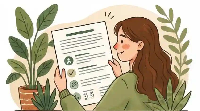
What Are Resume Icons?
Resume icons are small graphic symbols placed on a job application to mark contact details, skill labels, or section headers. A phone symbol next to your number, a briefcase icon labeling work experience, or a LinkedIn logo in the header — these are all resume icons. Whether they help or hurt your application depends entirely on what type of icon you use and how your resume gets reviewed.
There are two types to know. Image-based icons (PNG, JPG, SVG files) are invisible to ATS software — the system either skips them or produces garbled output. Text-based icons using Unicode characters or font libraries like Font Awesome behave like normal text and are far safer. Most people unknowingly use image-based icons exported from tools like Canva, which is where the problem starts.
"If they serve a purpose and make your resume easier to navigate and read, then it could be a good idea to use icons."
— Jon Shields, Content & SEO Lead, Jobscan
The key word is purpose. Icons that serve no informational function beyond decoration are the ones that cost you. The sections below walk through exactly where that line falls — and how to stay on the right side of it.
Resume Visual Plan: Get Maximum Clarity and Impact
-
01
Get Rid of the "Symbol Translation Cost" Use clear, normal words instead of decorative icons so recruiters don't have to pause and guess what symbols mean, allowing them to focus on your career results.
-
02
Focus on Layout Spacing Over "Visual Clutter" Use planned empty space to guide the reader's eye instead of using icons, making sure they spend their limited attention on your achievements with numbers, not on a messy layout.
-
03
Stop "Bad Output from Automated Systems" Remove non-standard symbols. Get rid of graphics so that resume reading software doesn't misunderstand or erase your contact details, keeping your profile easy to find.
-
04
Make Reading Effortless Show professional maturity by choosing a simple, super-clear design. This signals that you care more about the reader's speed than just looking like a typical "Canva" design.
-
05
Only Use Icons for "Basic Info Anchors" Only place small icons at the edges of your contact section to keep basic details separate, so they don't break the flow of your work history narrative.
Resume Design Check: Visual Markers vs. Distracting Clutter
As someone who checks these documents professionally, I have looked at how resumes are designed today. The key shift needed is moving away from the "Canva style" to designs that use visuals to help people understand things quickly.
Design Goal: Treating the resume like a picture project; using icons to seem "creative" or "up-to-date" when the actual content is weak.
Uses icons to add "creativity" or "modern feel" to cover up weak content.
Treats the resume as a serious business paper; uses design to make reading fast and easy, focusing on achievements.
Reader Focus: Making the recruiter try to understand symbols (like a briefcase for jobs), which causes small delays that take focus away from your actual skills.
Makes the reader decode symbols (like a briefcase for experience), creating small delays that distract from what you offer.
Uses bold text and different text sizes to lead the eye straight to results that have numbers.
System Safety: Putting icons and symbols everywhere, which often leads to the resume looking messy or losing information when read by automatic systems (ATS).
Includes icons everywhere, which often causes automatic reading systems to create garbage text or drop important details.
Focuses on using proper layout spacing; avoids images that confuse computer reading to guarantee your information is always searchable.
Use of Details: Spreading colorful icons around for skills, hobbies, and contact info, making the document look messy and immature.
Spreads colorful icons everywhere for skills, hobbies, and contact info, making the document look cluttered and young.
Keeps minimal icons only for necessary contact data to keep the main sections (Experience/Impact) clean and focused on text.
Information Order: Spending hours making sure icons are perfectly lined up and choosing the right brand colors.
Spends hours making sure icons line up perfectly and picking brand-matching colors.
Focuses on putting in important professional details; uses empty space carefully so the most important results are easy to find.
The Operations Expert's Resume Plan: Fast Data Interface
Look closely at everything. You can't fix what you haven't questioned. Many people still have things on their resume from years ago just because someone said it looked "new." This step means looking at every single non-text item to see if it helps or hurts.
- Look at your current resume and ask about every icon: "Does this picture show information that 12pt bold text can't show?" If the answer is no, remove it.
- Mark any icons used for "Work History," "School," or "Skills." Change them right away to simple titles (like EXPERIENCE).
- Remove all social media icons. Replace them with simple links (like `linkedin.com/in/yourname`).
"A clean document where 100% of the visual space is used for your professional story, not for fancy design touches."
How often: Every time you review it personally. This step is about getting rid of old design choices you kept just because they looked "new" back then.
Easiest Path for the Eyes. Instead of using icons to "point things out," we use Empty Space and Text Weight (boldness) to naturally guide the reader. The reader's eyes should flow down the page, hitting your results like mile markers on a highway, not like obstacles.
- Set up focus areas: Use 14pt Bold for Company Names and 12pt Bold for Job Titles. Use regular 10pt or 11pt for the achievement details.
- Make your page margins at least 0.75 inches wide to look more professional.
- Use thin, light grey lines to divide big sections, which looks cleaner than using icons as dividers.
"The document must pass the 'Squint Test'—if you squint, you should still easily see the main titles and results based on how bold they are and where they are placed."
When: When you get a new job, finish a big project, or get a new skill. Lots of empty space shows you are confident, while squeezing things together looks desperate.
Make Reading Effortless. This is the final check to make sure your resume survives the "Digital Blender" (ATS) and the "Human Check" (the 6-second scan). We need the data to be pulled out without friction — every time, on every system. This step also ensures your resume is readable by everyone, including screen readers used in accessibility reviews.
- Save your resume as a plain text file (.txt) and check if any characters look messed up, which means the ATS will have trouble reading it.
- If you keep icons for Phone/Email, put them only at the very top, separated by simple vertical lines ( | ).
- Check your achievement points to make sure they follow this order: [Action Word] + [Number Result] + [What it was for].
"The most professional move is realizing that a strong sentence like 'Made churn drop by 14% through...' looks much better than any colorful icon ever could."
How often: Every six months or before you send it for a referral. The final goal is for the document to look the same and be readable by all software.
The Recruiter's View: Why Smart Visual Markers Add 20% Value
I don’t read your resume closely. I scan it fast. I have 400 people applying for one manager job, a headache, and only six seconds to decide if you should get a call. When you use icons correctly, you aren't just decorating—you are helping my brain work less hard.
Having to search through big blocks of text for basic facts (like how to call you) makes the recruiter tired. This quickly leads to the feeling that the applicant is bad at organizing things.
Using simple, recognizable symbols lets my eye land right where it needs to be. This makes the job easier for my brain and immediately suggests the applicant is organized and worth looking at closer.
Small, professional icons show that you understand how to organize information: how to present hard facts in a form anyone can read in seconds. This moves you from the pile of "average applicants" to the "carefully selected professionals" that companies pay more for. If you want to know which icon styles are trending in hiring right now, see our guide on resume design trends.
This appearance of being easy to work with is automatically linked to your actual ability. Making the manager's job easier with clear documents proves you are a clear speaker—the number one quality needed for top jobs.
Cruit Tools for the Operations Expert's Plan
Plan Alignment: [Step 1]
Resume Tailoring ToolHelps you get rid of old design choices using templates safe for ATS to replace picture labels with required text titles.
Plan Alignment: [Step 2]
General Resume ToolAutomatically handles "Layout Spacing" using a smart design system for exact text formatting.
Plan Alignment: [Step 3]
Note Taking ToolThe Smart Coach for Notes automatically creates points that follow the formula: [What I Did] + [Number Result].
Deciding on Icons
Do resume icons actually save space on a one-page resume?
Even though a small phone picture takes up less side space than the word "Phone," you aren't really gaining useful room. You are paying a translation cost instead.
The goal of a resume is not to fit everything into tiny spaces, but to direct the reader to your most important successes. If you feel you need icons to squeeze things in, the issue isn't the text size — it's that you haven't been strict enough in showing only your most valuable work.
Should I use icons on my resume to show I'm tech-savvy?
The most tech-savvy thing you can do for a recruiter is give them a document they can read in seconds.
True technology skill shows through clean, scannable communication — not through pictures that might cause ATS parsing errors. A text-based layout tells the hiring manager you understand professional communication, while a resume full of on-brand icons suggests you care more about decoration than facts.
Will my resume look boring without icons?
Your resume's visual impact should come from strong action words and specific results — not from a logo or a briefcase picture.
If you must use icons, limit them to basic contact details (email, phone, location) so that info stays visually separate from your work history. Top candidates don't need clip art to stand out. They use well-placed whitespace to ensure their strongest achievements are the first thing a recruiter sees.
Does ATS software actually reject resumes with icons?
Image-based icons embedded as PNG or JPG files cannot be read by ATS software. The system either skips them or converts them to garbled characters, which can corrupt your contact details before a recruiter ever sees your application.
Since 98% of Fortune 500 companies use ATS to screen applications (Jobscan, 2024), and 75% of resumes are rejected before a human reviewer sees them, icon-related parsing errors are a real risk — not a theoretical one.
Which types of icons are safe to use on a resume?
Text-based icons using Unicode characters or font libraries like Font Awesome behave like regular text and are the safest choice for ATS compatibility.
If you use icons, keep them to contact information only, always pair them with plain text labels, and avoid image formats (PNG, JPG) entirely. Tools like Canva export image-based icons by default, which is why Canva-designed resumes often fail ATS screening.
Focus on what counts.
Stop getting stuck in the COMMON MISTAKE of treating your career history like a graphic design project that risks getting messed up by automated systems.
Making the SMART SHIFT toward a clean, information-packed text format protects your career from being lost in a mess of confusing symbols and ATS errors. The smartest design choice you can make is removing every hurdle between the recruiter’s eye and what you have achieved.