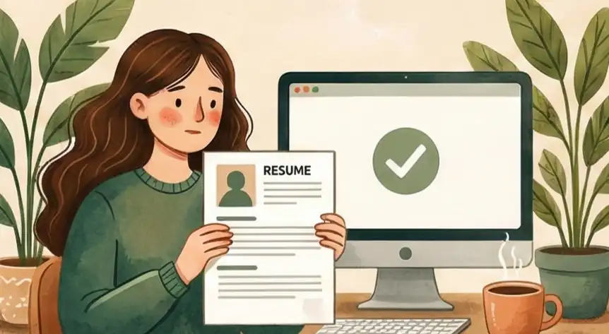
Do Graphics, Tables, and Columns Break ATS Scanners?
The Resume Lie and The Two-Viewer Design
Graphics, tables, and columns can break ATS scanners, but not always. The real issue is how you use them. Floating text boxes and embedded images confuse most applicant tracking systems, while properly structured tables and single-row layouts parse correctly. The goal is a "Two-Viewer Design" that both the software and the recruiter can read.
Many career advisors have given you bad advice based on a fear of ATS resume formatting. They tell you to strip all graphics, tables, and columns from your resume, leaving a boring document in 12pt Times New Roman that looks like an old legal paper. This "safe" approach assumes that applicant tracking systems still work like primitive text scanners from 2005. That defensive thinking is holding your career back.
If you only design for the machine, you suffer the "Cost of Human Dislike." A document built for a computer alone becomes hard for the recruiter to read. According to a TheLadders eye-tracking study, recruiters spend an average of 7.4 seconds on their initial resume scan, following an F-pattern from top-left down. A flat "Block of Text" forces the human to work hard to find your value, and most won't bother. You may pass the ATS check, but you fail the visual "gut feeling" test because your document looks weak and lacks clear organization.
The right way forward needs a "Two-Viewer Design" based on clear information levels. You don't have to get rid of design; you need to know how to build a document well. Visual cues and "Information Clues" let you create a document that converts well, is readable by the machine, and still persuades the human. This guide shows you how to build a resume that gets attention from both the ATS software and the hiring manager.
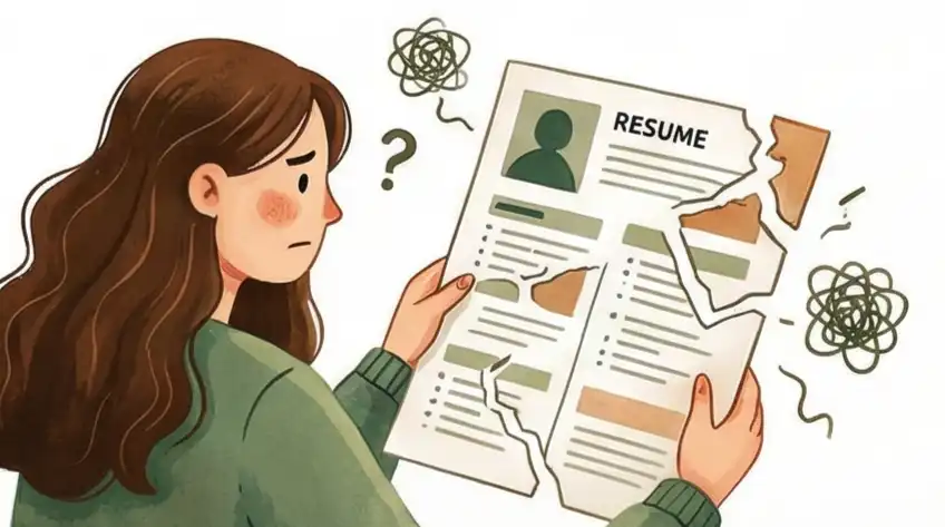
What Are ATS Scanners and Why Do They Reject Resumes?
An ATS (Applicant Tracking System) is software that companies use to collect, sort, and rank job applications before a human recruiter sees them. According to Jobscan's 2025 research, 97.8% of Fortune 500 companies use an ATS, with Workday alone powering 37.1% of those systems. Industry data shows that roughly 75% of resumes are filtered out by ATS software before reaching a recruiter's desk, often because of formatting problems rather than missing qualifications.
ATS parsers work in a specific sequence: they extract raw text from your file, segment it into sections (experience, education, skills), then match keywords against the job description. Graphics, complex tables, and floating text boxes disrupt this extraction step because the parser can't read image-based content or follow non-linear text flows.
Resume Strategy: The Up-to-Date Way
-
01
Use Clear Information Layers Use normal section titles along with smart bolding to create a clear structure for the document. This helps the software map your information correctly while letting a recruiter quickly find your career "Information Clues" in three seconds.
-
02
Check for the "Digital Ghost" Copy and paste your nicely designed resume into a simple text file (.txt) to make sure the reading order is still logical. This simple check confirms you have a "Two-Viewer Design" that works for the machine's need for structure without losing the human's need for good looks.
-
03
Get Rid of the Human-Dislike Cost Swap out 12pt Times New Roman "Block of Text" layouts for modern, clean fonts and smart use of empty space. Prioritizing visual appeal avoids the "Tired Reader" feeling that makes recruiters quickly reject documents that look like old legal papers.
-
04
Use Mixed Structure Styles Stop using complicated sidebars and use simple single-row tables with hidden lines to organize key skills or numbers. This keeps the professional look of a top executive report while stopping old computer parsers from "choking" on data that runs across columns.
-
05
Look Professional and Trustworthy Add small touches of branding, like one accent color or a simple line divider, to quickly show you are credible. Moving away from "Plain-Text Fear" shows the hiring manager that you are a modern leader who knows how to present valuable information to a smart audience.
Checkup: Document Layout & Computer Compatibility
This check looks at how your document is built compared to what modern hiring expects, contrasting old "Plain-Text Fear" with the high-conversion method of "Clear Information Layers." We look at the key balance between being readable by the computer and interesting to the human.
Keeping everything in a single line, one-column document that looks like a legal paper or an old computer file.
Keeping everything in one column just to be safe for the machine.
Using two columns or real table cells to create "Information Clues," separating main job history from technical skills.
Using the same font size and plain black text everywhere, creating a "Wall of Text" that gives the eye no guidance.
Avoiding all bolding and contrast just to keep the machine happy.
Using bolded results, smart empty space, and light grey sidebars to draw the recruiter’s eye to "Impact Areas" in under 6 seconds.
Removing every line, border, and box out of worry, creating a document that is "safe" for computers but tiring for people.
Removing all structure that might confuse a parser.
Using normal document columns and table styles (avoiding text boxes that float) to make sure the machine reads in a correct left-to-right order.
Focusing 100% on the weakest computer program, acting like the ATS is a very basic wall that cannot handle modern design.
Designing only for the machine’s ability to read text strings.
Focusing on the "Two-Viewer Design," making sure the file is structured for the machine’s data entry while looking like a high-converting sales page for the human.
Hiding your key achievements inside long, plain paragraphs to avoid "breaking" the scanning software.
Using thick blocks of writing to make sure text appears in order.
Structuring data so the machine pulls the text in order, while the human sees a professional, modern "Authority Look" instantly.
The Resume Change Plan: From Text Wall to Smart Tool
Modern ATS programs (like Workday, Greenhouse) read data in a straight line. The "Plain-Text Fear" comes from using Floating Text Boxes, which sit outside the document's main data stream. You must replace "Fancy Layouts" with "Smart Layouts" so the data structure is correct without losing the visual structure. If you're wondering whether the whole idea of "tricking" an ATS is even worth pursuing, see our guide on whether you can trick an ATS.
- The Self-Check: Open your current resume. Press `Ctrl+A`. If any text does not get highlighted, it is a floating item (Text Box, Shape, or text wrapped around a graphic). Delete it right now.
- The Replacement:* Switch from "Text Boxes" to *Tables with Single Rows and Multi-Columns. Make the borders invisible. This keeps the "Reading Order" (left to right) correct while still allowing for the "Sidebar" look that recruiters like for skills and contact details.
- Clear Title Setup: Use standard Word "Styles" (Heading 1, Heading 2) for your section titles. Do not create your own "Artistic" titles; the software is programmed to look for the "Experience" and "Education" tags in standard title settings.
"A 'Flat Layout' where 100% of the content can be selected and follows a direct, straight path for the software."
When this matters: Right away / Every time you change career direction.
Recruiters don't "read" resumes; they "sample" them. Information Clues guide the human eye to your most important data (Impact Spots) while the machine keeps reading the full text. This fixes the "Human-Dislike Cost" and makes it easier for people to find your value.
- Key Result Bolding: Don't just make job titles bold. Make the number in the bullet point bold (e.g., "Boosted Profit by 22%"). This creates a "Visual Marker" that the human eye catches when scrolling fast.
- The Smart Sidebar: Use a light grey color (via Table Cell Shading) for your "Skills List" or "Competencies" column. This creates a visual "Box" for the human, while the machine just sees normal cell data.
- Smart Empty Space: Increase the space between lines to 1.15 for main text but keep it at 1.0 for bullet point groups. This "Idea Grouping" tells the human eye where one point finishes and the next starts.
"A document that looks good, allowing a human to pull out your 3 biggest achievements in under 10 seconds without messing up the software's flow."
When this matters: Every Month / When you hit a big achievement.
Never guess how a computer sees your file. You must test it: simulate the ATS process to find "Data Jumbles" where columns or tables might merge incorrectly.
- The .TXT Conversion Test: Save your designed resume as a "Plain Text (.txt)" file. Open it. This is exactly what a basic or poorly set-up ATS sees.
- Data Check: In the .txt file, check if your "Skills" (from your sidebar) are now randomly mixed into the middle of an "Experience" sentence. If they are, your table setup is wrong.
- The "Self-Question": Ask yourself: "If I only saw this text file, would I still hire this person?" If the answer is no because the look made the content confusing, go back to simpler table setups.
"No 'Data Jumbles' when exported to plain text, meaning 100% accuracy in the ATS profile."
When this matters: Every few months / Before any "Easy Apply" option.
A top-level professional shouldn't be "searching for a job"; they should be "managing their public image." When a recruiter contacts you, you don't send a document that's half-done. You send a version of your Two-Viewer Design set up for the specific platform they are using.
- The Mixed Export:* Always save the final version as a *PDF that has Hidden Structure Tags. This keeps the look for the human while giving a "Map" for modern software to follow.
- The "Feel Check" Test: Before sending, look at the document on a phone. If your columns make the text too skinny to read on a phone, you've put too much design in. Aim for a "Mobile-Friendly" approach: keep sidebars to about 30% of the width.
- Image Update: Every 3 months, swap out one "Old Duty" description for one "Key Result Number."
"Keeping a 'Ready-to-Send' document that shows modern professional strength and technical skill to both the software and the hiring manager."
When this matters: When the "Hidden Job Market" (Recruiter Contact) starts.
The Recruiter's View: Why Clean Layout Adds 20% Value
I've been in countless meetings where a candidate's resume is a mess of columns and pictures. That doesn't look "creative"; it looks like a headache. In a process with many applicants, we are looking for reasons to throw resumes out, not reasons to keep them. A clear, computer-friendly path means you never give us a reason to reject you.
"Over 40% of recruiters are immediately turned off by resumes with flashy design elements like multiple colors, graphics, or hard-to-read fonts. At the same time, 83% say they're more likely to hire a candidate with a well-formatted resume."
Layouts with multiple columns and graphics often confuse the Applicant Tracking System (ATS), leading to broken profile data (like phone numbers showing up in the 'Skills' field). This forces recruiters to manually fix your profile, turning early interest into immediate frustration and rejection because it wastes their time.
A simple, straight-line text layout ensures the ATS reads the data easily. This simple data pull allows the recruiter to instantly find your main results and easily sell you internally, which builds trust in your candidacy and often leads to a better starting salary offer.
When hiring for high-level roles, overly flashy visuals often suggest the candidate is hiding a lack of real results and numbers. We are naturally suspicious that visual flash is being used instead of actual impact (money saved, efficiency gained, growth achieved).
The clean, organized layout suggests you know what matters. This feeling of "less risk" is why a well-structured resume helps justify a higher salary offer, as you seem like the "safer, smarter choice." For a broader look at what makes a resume stand out in modern ATS environments, check our deep dive on the myth of the perfect ATS resume.
Making Your Operations Plan Automatic with Cruit
Plan Match: Step 1 & 3
Resume Customization ToolMakes sure layouts are "Structurally Sound" over "Just for Show" using templates that work with ATS. Performs the "Computer Test" by scanning job posts for correct word matching.
Plan Match: Step 1 & 2
Basic Resume ToolAutomatically runs the "Self-Check" and organizes section titles correctly by using smart formatting to keep "Idea Groupings" and "Smart Empty Space."
Plan Match: Step 2 & 4
Note-Taking ToolKeeps a database of your "Information Clues," pulling out "Key Result Numbers" to make sure you always have a "Ready-to-Send" document during an "Image Update."
Frequently Asked Questions
Can ATS read tables on a resume?
Yes, most modern ATS platforms like Workday and Greenhouse can read simple, single-layer tables. The problem starts with nested tables (tables inside tables) or tables with merged cells, which break the reading order. Stick to single-row tables with invisible borders for layout purposes, and never nest data tables inside each other.
Do two-column resumes get rejected by ATS?
Not automatically. Older ATS software could read across the page (mixing left and right columns), but modern systems handle columns better. The safest approach: use a sidebar for fixed details like skills or education, while keeping your main work history in a single top-to-bottom flow. Always run the .txt paste test to confirm the reading order stays logical.
Do graphics and icons break ATS parsing?
Icons and graphics themselves are invisible to ATS parsers. The system can't extract text from an image, so a star-rating graphic for "Python: Expert" shows up as blank space. The fix: always pair visual elements with real text. The ATS reads the keyword, while the human sees the visual shorthand.
Should I submit my resume as PDF or DOCX for ATS?
Both work with modern ATS, but each has trade-offs. PDF preserves your formatting exactly, while DOCX gives parsers the cleanest text extraction. The best option: save as a tagged PDF, which keeps the visual design intact while embedding a text structure map for the ATS to follow. If the job posting specifies a format, always follow that instruction.
How do I test if my resume is ATS-friendly?
The quickest test: save your resume as a .txt file and open it. If the text reads in logical order (name, contact info, summary, experience, education), your layout works. If skills from a sidebar appear mixed into job descriptions, your formatting is breaking the parser. You can also use free ATS scanning tools to check keyword matching and parsing accuracy. For a deeper look at testing methods, see our guide on how to test if your resume is ATS-friendly.
What is the safest resume layout for ATS?
A single-column layout with standard section headers (Experience, Education, Skills) is the safest baseline. If you want visual polish, use a narrow sidebar built with a single-row table (not a text box) for contact info and skills. Keep your work history in the main column. Use standard Word heading styles so the ATS can map your sections correctly.
Protect Your Professional Worth
Stop treating your resume like a fragile form to be filled out and start treating it like the important sales tool it is. Clear Information Layers protect your Professional Worth from being lost in a "Block of Text" that recruiters just won't read.
Give up the OLD WAY of "Plain-Text Fear" and make a SMART SWITCH to a document that gets respect from both the software and the person who makes the hiring decision.
Start Cruit Now