What You Should Remember for Updating Your Profile Now
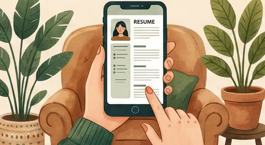
Stop focusing on how your resume looks on a big computer screen. Instead, organize everything in a single vertical stack that works on a small phone screen (320 pixels wide). This keeps your important information clear, avoids sideways scrolling, and packs the most value into the space available for mobile readers.
Test if your format breaks when all the styling is removed. If the structure survives being saved as a simple text file, it means your data won't get mixed up or lost when older systems (like Applicant Tracking Systems or ATS) try to read it.
Think of your career details as building blocks you can reuse anywhere, not as one finished PDF document. Keep one main, correct version of your data (a Single Source of Truth, or SSoT) in a simple format, then update your profile on LinkedIn, job forms, or emails while keeping all versions accurate.
Change your thinking from "making a document" to "making an interface easy to use." Use the "Thumb-Scroll Squint Test" (how fast can they see the key info while scrolling quickly on a phone?) to make sure recruiters can find the most important numbers in just a couple of quick swipes.
The main goal is to design for the way people check profiles on their phones quickly. This means stacking things vertically, making sure plain text works, and making sure your key skills are understood fast. Speed of reading is the top priority for getting a recruiter interested.
Taking Control of Your Career Story
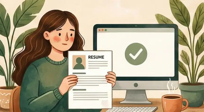
A mobile-friendly resume is no longer optional. According to the Jobvite 2023 Recruiter Nation Survey, 73% of recruiters now use mobile devices daily to review candidates. If your resume forces pinch-and-zoom on a phone screen, it gets skipped, no matter how strong your experience is.
Recruiters don't give you extra time to make a good impression. An eye-tracking study by Ladders found that the average initial resume scan lasts just 7.4 seconds. On a phone, that window shrinks further. If your layout breaks on a small screen, those seconds are wasted on scrolling and squinting instead of reading your accomplishments.
The fix isn't complicated. It comes down to structure, not style. This guide walks through how to format your resume so it reads clearly on any device, passes ATS screening, and puts your strongest qualifications where a recruiter's thumb lands first.
Most candidates still design their resume for a desktop monitor. That's the core problem. The recruiter reviewing it at 8 PM is doing so on a phone, scrolling with one thumb while standing in line for coffee.
Statista reports that mobile devices generated 62.54% of global website traffic in Q4 2024. Job boards follow the same pattern. If your two-column layout collapses into overlapping text on a 5.8-inch screen, the recruiter moves to the next candidate.
Your resume needs to work for the device in the recruiter's hand first. Everything else, including the desktop view, follows from that.
What is a Mobile-Friendly Resume?
A mobile-friendly resume uses a single-column layout, standard fonts (Arial, Calibri, or Verdana at 11-12pt), and clean formatting so recruiters can read it on a phone without zooming or scrolling sideways. It also passes ATS parsing by avoiding tables, columns, graphics, and embedded text in images.
The distinction matters because what looks polished on a desktop monitor often becomes unreadable on a 5.8-inch phone screen. Headers overlap. Sidebar content stacks below the main body in the wrong order. Bullet points wrap awkwardly. A mobile-friendly format prevents all of this by designing for the smallest screen first. For a broader look at how formatting affects readability, see our guide on accessibility in resume design.
"When I'm reviewing resumes on my phone between meetings, I need to see the candidate's value in one scroll. If I have to pinch and zoom, I'm already moving to the next person." — Talent acquisition director at a Fortune 500 technology firm
The Hidden Checklist Recruiters Use
This candidate shows they understand how people work by making their information easy to read, meaning they will naturally prioritize the needs of customers and teammates in their actual job.
By making sure their career story works across different platforms, the candidate proves they can take big ideas and present the most important facts quickly to help people make fast decisions.
A resume that works in both machine systems (ATS) and human eyes shows they are a "low-risk" hire because they know how to balance technical needs with human common sense.
This person has the foresight to design their work for how it will be used, not just how it was created, which signals they will stop problems and bottlenecks for their team before they start.
The 3 Steps to an Error-Proof System
Check Your Information Order
Getting caught in the "Big Screen Looks Good" Trap. Designing for large monitors, which results in a messy, hard-to-read disaster on phones or in automated systems.
How to Fix It: The One-Column Rule
- Action: Take out sidebars and multi-column layouts. Switch your structure from "Grid-Based" to "Stack-Based" (one thing right after the other).
- Test: Use the "Thumb-Scroll Squint Test" on a phone set to 320px width.
- If you have to zoom in or scroll sideways, the structure is wrong because it's too much work for the reader.
Check for System Compatibility
Data Confusion caused by using fancy symbols or putting text inside pictures. This can make your profile look scrambled or cause data to disappear completely when systems read it.
How to Fix It: The .TXT Stress Test
- Action: Save your resume as a simple text file (.txt) to check if the structure holds up without any style. (See our full guide on how to test if your resume is ATS-friendly.)
- Test: Look for "Data Bleed" (where dates don't line up with job titles).
- Fix it using only standard keyboard symbols (like | or -) to make sure the data stays safe when systems convert it.
Manage Content Like Code
Static Copying. Saving your resume as a final PDF means you have to manually copy and paste sections everywhere, which leads to mistakes and inconsistent information.
How to Fix It: Keep a Master File
- Action: Treat your resume as "Code." Keep all your accomplishments in one main file (like Markdown or a simple list).
- Test: Use this file as the "Single Source of Truth" (SSoT) for all profiles.
- This lets you deploy your data across different platforms without errors or layout conflicts.
How Your Mobile Resume Changes as You Get More Senior
As someone who works with talent, I see a resume as proof of how well you understand how the business world works. How you create a mobile-friendly resume shows where you are in your career, whether you are focused on just getting the work done or on strategy. Here is how making your resume phone-ready looks different at different career levels.
Doing the Job Right
When you are junior, you need to show you can research the best way to do a task and finish it correctly on your own. A simple, phone-friendly resume proves you understand the "delivery basics."
"A clean, single-line layout shows you can spot and fix formatting problems before a recruiter even sees them."
Working Smart and Impacting Projects
When you are mid-level, it matters how you manage information. A phone-friendly resume shows you know that time is valuable. It's about putting the most important achievements where they can be seen immediately. For more on staying current with layout choices, see resume design trends.
"You put the 'Result' right at the beginning of your sentence so that the recruiter sees the main benefit even if they only look for a second."
Strategy, Risk, and Money Returned
For leaders, a mobile-friendly resume proves your overall business sense. If an executive’s resume is hard to read on a phone, it suggests they are not aware of modern technology and could be a risk to the company's operations.
"A tight, 3-line summary at the top of a mobile screen proves you can grab attention and explain your value to the entire company in seconds."
Comparing Formats: Standard vs. Professional
| Area | Common Mistake | Mobile-Friendly Fix |
|---|---|---|
|
Layout Structure
|
Multi-Column Designs
Using sidebars, two-column layouts, and decorative headers that collapse into overlapping text on phone screens and confuse ATS parsers.
|
Single-Column Stack
Design for a 320px-wide phone screen first. Use one vertical column that passes the "Thumb-Scroll Squint Test": can a recruiter see your key info in two quick swipes?
|
|
Parsing & Display
|
Special Characters & Graphics
Using fancy symbols, icons, or embedding text inside images. ATS software scrambles or drops this data during parsing.
|
Plain Text Safe
Save as .txt and check that your structure survives. Use only standard keyboard characters (hyphens, pipes, bullets). If it reads cleanly in Notepad, it will parse cleanly in any ATS.
|
|
Version Control
|
Static PDF Copies
Treating the PDF as the final product and manually copying sections to LinkedIn, job forms, and emails. This creates version drift and data errors.
|
Single Source of Truth
Keep all accomplishments in one master file (Markdown, plain text, or a tool like Cruit). Generate tailored versions from that file so every platform gets the same accurate data.
|
| Bottom line: Design for the phone first. If it works on a 320px screen and survives a .txt export, it will work everywhere else. | ||
How Far Along Your Document Is
- Problem State 1 The Paper Document: You treat the PDF as final. Updating it for every new application is slow, difficult, and often leads to mistakes.
- Problem State 2 The ATS Mess: The structure is based on visuals, meaning the system reading it scrambles your information when it tries to clean it up.
- The Professional Goal The Data Source: You treat your resume like code: modular, ready for any platform, and safe from breaking down in any system or on any screen.
Make Your Mobile Resume Better with Cruit Tools
For ATS & Mobile Reading
Resume Tailoring ToolGives you templates that look professional and are easy for phones and ATS to read, ensuring your file passes the simple text test.
For Showing Value Quickly
General Resume ToolAutomatically changes your job duties into strong statements with numbers, making your best results immediately visible on a small screen.
For Your Career Data Hub
Idea Log ToolThis is your "Master List" file. It saves all your accomplishments so you can pull them out to build error-free profiles for any mobile job site.
Common Questions Answered
Does simplifying my resume for mobile make it less impressive?
No. If your experience is stuck in a layout that forces pinch-and-zoom, your skills look worse, not better. A recruiter who can't read your resume on a phone will skip it.
Clarity is what shows skill. A phone-friendly structure removes the obstacles between your achievements and the recruiter. If they can't read it on the go, your experience won't register.
Do I need separate resume versions for mobile and desktop?
No. You need one file that works everywhere. Design for the smallest screen first, and the desktop version takes care of itself.
One layout with a single vertical column and standard fonts creates a universal file. That single design works on an iPhone, a desktop monitor, and inside an ATS system at the same time.
Should I use a graphic-heavy resume to stand out?
Only if visual design is the primary skill for the role (graphic designer, art director). For most jobs, graphic-heavy layouts break on mobile screens and confuse ATS parsers.
If a layout fails the .txt stress test or makes phone scrolling frustrating, it's hurting your chances. Data-backed results beat decorative design every time.
What font size should I use for a mobile-friendly resume?
Use 11-12pt for body text and 14-16pt for section headings. Stick to standard fonts like Arial, Calibri, or Verdana that render consistently across all devices.
Anything below 10pt becomes unreadable on a phone without zooming. Once a recruiter has to zoom, you've already lost their attention.
How do I test if my resume is mobile-friendly?
Email your resume as a PDF to yourself, then open it on your phone. Can you read everything without zooming or scrolling sideways? Can you see your name, title, and top results within the first screen?
Then run the .txt test: save your resume as plain text and check that names, dates, and job titles still align correctly. If it passes both tests, it will work on any device and in any ATS.
What file format is best for mobile resume submissions?
PDF is the standard. It preserves your formatting across devices and works with nearly every ATS. Keep the file under 1MB so it loads quickly on mobile networks.
Avoid .docx unless the posting specifically requests it. Word files can render differently across devices and operating systems, creating layout problems you can't control.
Focus on what works.
Stop thinking about the "Creation Environment" (how you build it) and start thinking about the "Consumption Environment" (how it's read). Most candidates fail because their resume structure doesn't adjust. It looks fine on a laptop. It falls apart on a phone.
That mismatch causes recruiters to give up before reading a single bullet point. They scroll, squint, and move on.
The fix is structural, not editorial. Your information needs to move cleanly between ATS software, a desktop browser, and a 5.8-inch phone screen. If your resume can't do this, you are hiding yourself.
Open your resume on your phone right now. If you have to zoom in, start over with a single-column layout. Remove the sidebar. Test it as plain text. The best-structured candidate wins when attention is limited.