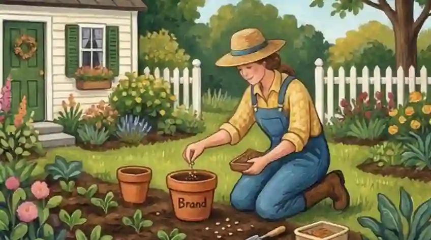
Making Your Visuals Stand Out
Stop wasting weeks on mood boards and color guides telling you your brand visual identity should signal "trust" with blue. You've been tricked by the "Look Good, Be Safe" trap — the idea that a simple, light-colored look is the best way to seem serious. The truth is, you just look like a nice picture you'd find for free online: nice, safe, and easily forgotten.
This need to look the part leads to Blending In. When you follow the "safe" design rules, people automatically skip over you. When your look is the same as every other company website or social media post, you tell the world you have nothing new to share. You work much harder on your message, but your look keeps you hidden. This is more than just a bad design choice; it slows down how much influence you have.
To truly matter professionally, you must switch to Visual Interruption. Stop designing just to look pretty and start designing to make people stop scrolling. Brands that are truly important don't just fit in; they give a visual jolt that makes the brain pause long enough for the actual point to sink in. This guide shows you how to use strong visual differences to break out of the "Same Crowd" and make sure your brand gets the attention it deserves.
What Is Personal Brand Visual Identity?
Personal brand visual identity is the set of visual elements — colors, fonts, imagery, and layout — that make a professional instantly recognizable across platforms. It's the difference between being scrolled past and being remembered.
For job seekers and professionals, a visual identity isn't about looking pretty. It's a strategic signal. Research shows that people form a subconscious judgment about a brand within 90 seconds of first viewing, and up to 90% of that initial assessment relies on color alone, according to research published in Management Decision (Singh, University of Winnipeg). Your visual choices either invite attention or lose it before a single word is read.
This guide goes further than the standard advice. Rather than teaching you to blend in with "professional" colors, it shows you how to use strong personal brand contrasts to stop the scroll and make your identity the one people actually notice.
Visual Plan: Breaking Away from the Crowd
-
01
Get Rid of Blending In Purposefully ignore the colors and simple templates your industry uses to stop people from automatically skipping you and force them to pay attention.
-
02
Use Visual Shocks Use very different color mixes and bold fonts to break the "Same Crowd" look and grab those key few seconds needed for your message to be heard.
-
03
Use Strong Visual Differences Swap out passive "Matching the Look" for clear, visual differences that immediately show you are different and have original authority, instead of being a safe, forgettable option.
-
04
Use Pattern Stopping Go against the usual design rules in your specific field to show a high-status, non-following brand look that captures attention before anyone reads a word.
-
05
Stop Wasting Effort Make sure your visual look supports your boldest ideas, so your design works as a mental hook that makes everything you create more valuable.
Visual Check: How Normal or Different Is Your Look?
This check compares the usual way of designing based on looks that causes you to blend in ("Junk") against the powerful, breaking-the-mold way top brands get noticed ("Expert Fix").
Color Choices: Trying to seem trustworthy by using common colors.
Picking "safe" colors based on simple ideas (like blue for trust, green for growth) so the brand looks normal and established.
Figure out the colors everyone else uses and deliberately choose a high-contrast "disruptor" color that clashes with what people usually see when they scroll.
Fonts & Text Style: Aiming for a clean, simple look by copying popular brands.
Using common, simple fonts (like Inter or Montserrat) to get a "clean" and "modern" feel that copies top tech companies.
Use "Pattern Interruption" fonts—fonts that are very large, very bold, or slightly "unattractive" that make the eye stop because they don't look like an advertisement.
Pictures & Graphics: Relying on very polished visuals that match the mood board.
Picking high-quality stock photos or perfectly polished AI images that create a uniform, nice-looking mood board.
Choose pictures that look raw, real, or "low-quality" that feel human and instant, standing out against the overly polished "Same Crowd."
What is "Brand Consistency": Making sure everything looks perfectly matched everywhere.
Making sure every piece of content exactly follows the brand rules so that nothing seems strange or out of place to the viewer.
Focus on the "Ugly Duckling Rule"—breaking your own design rules sometimes to show that a specific message is too important to waste time making "pretty."
The Main Goal of Design: Looking high-quality by fitting in.
To be seen as "good quality" and "professional" by looking like everyone else in current trends.
To create a "Visual Shock" that stops the mind from automatically skipping and makes the brain process the content.
The Step-by-Step Guide: Moving from Polished Look to Disruptive Signal
To break a pattern, you first have to see the pattern. Most people just copy the top 5 people in their field without thinking. This step finds the "Same Crowd Look" so you can do the opposite.
- The Competitor Picture: Grab screenshots of 10 competitors' LinkedIn profiles or websites and put them on one board.
- Find the Usual Look: Write down the colors (usually dark blue, white, or "tech blue"), fonts (like Inter or Roboto), and pictures (nice offices or generic teamwork shots) that show up most often.
- The "Don't Use" List: Make a list of these common elements and officially "ban" them from your brand look for the next 90 days. If everyone uses "Simple White," your default look becomes "Bright and Busy."
"I first looked at what everyone else is doing so I can be sure I don't accidentally blend in."
This step should take 60 minutes.
Strong Visual Difference. Instead of changing everything, introduce one "Visual Glitch"—one element that breaks the usual design rules. This forces the viewer's brain to stop scrolling to figure out the difference.
- Pick One "Loud" Color: Choose one color that clearly doesn't fit your industry's standard (like a neon orange in a sea of corporate blue, or a harsh lime green). Use this only for your most important buttons or lines under titles.
- Font Friction: Swap your simple headers for a font that has a lot of personality. Use either a very thick, classic Serif font (to look like established history) or a fixed-width Monospace font (to look technical and raw).
- The Question Signature:* Change your email signature and social media banners to show one **Challenging Opinion using this new font/color combination. Example: *"Why 'Best Practices' actually hurt your results."
"I'm creating a visual stop sign that earns me 3 to 5 extra seconds of attention every time someone sees my content."
This step should be done by Week 2.
Moving from "Looks Professional" to "Has Real Authority." Perfect pictures signal you have money; raw pictures signal you have ideas. This uses the "Ugly Duckling Rule" to build trust by being open.
- Stop Stock Photos: Cancel any subscriptions for stock images.
- The "Phone Photo Sermon" Style: When posting ideas, use pictures taken on your phone in strong light and shadow, rather than studio-perfect photos.
- Simple Visual Helpers: Instead of fancy charts, use a photo of a quick sketch on a napkin or a messy whiteboard. This shows that the ideas were so important they had to be written down right away, no matter the medium.
- The "Look Behind" Frame: Share a screenshot of a messy working file or a "Draft" folder to show the real work behind your strong opinions.
"I want to make my authority feel real and get rid of the "corporate mask" that keeps people from connecting with me."
This step should be done during your Weekly Content Creation.
Making sure the visual shock actually helps the message. A visual shock with no smart advice is just clickbait. This step matches your new "Visual Signal" with smart advice so you keep people interested long-term.
- The Contrast Check:* Look at your best posts. Did the "Visual Glitch" lead the reader to a *Challenging Insight? If the look was "loud" but the advice was "standard," change the writing to match how intense the visual was.
- The "Make Me Uneasy" Check: Ask someone you trust: "Does my brand look like it belongs in our industry?" If they say "Yes," you failed. If they say, "It looks a bit too strong/weird/different," you succeeded.
- Keep Track of Changes: Save a folder of your visual updates. Top brands keep changing their look to stay ahead of the "Same Crowd" as others start copying their disruptions.
"I want my visual look to be a changing tool that helps me win in the market, not just a fixed style."
This step should be done during your Monthly Review.
What Recruiters See: Why a Solid Look Adds 20% to Your Value
Looking at thousands of LinkedIn pages and resumes over the years shows a hard truth: recruiters spend as little as 6 to 8 seconds on an initial review, according to StandoutCV's 2023 recruiter study. A messy look — mixed fonts, bad colors, old photos — immediately makes them think you are a "low-value hire," causing them to offer you less money right away. To ask for 20% more, you must know the mental shortcuts people use.
A messy look (mixed fonts, bad quality pictures) signals you don't pay attention to small details. In the recruiter's head, this means you will need a lot of guidance, putting you in the lowest pay group automatically.
Using clean, organized fonts and colors that look good everywhere creates the impression of a "finished product." This signals low risk and that you manage yourself well, which justifies a higher salary offer without argument.
Controlling your visual identity uses The Halo Effect: if you look organized, people assume you are also organized in leadership and managing projects.
This process builds Belief by making things easy to understand. A good-looking brand is easy for the mind to handle, which subconsciously connects you to being "Truthful" and "Dependable." You switch from "needing a job" to being a "known figure," choosing offers instead of fighting for roles.
Cruit Platform Tools for Your Unblending Plan
Plan Steps: 1 & 4 Career Guidance Tool
Automatically finds where you stand against the market using smart questions to discover your visual blind spots.
Plan Step: 2 LinkedIn Writer
Turns your disruptive plan ("Loud Color") into finished profile words, focusing on your headline and detailed descriptions.
Plan Steps: 3 & 4 Note-Taking Tool
The place to keep records of your "Behind the Scenes" ideas, building a living list of your breakthroughs.
Common Questions: Dealing with Resistance to "Safe Design"
"But won’t 'jarring' visuals make me look unprofessional to big clients?"
People confuse professionalism with just blending in. In today's world, looking exactly like every other "safe" competitor doesn't show quality; it shows you are just another option you can get cheaply.
Visual Interruption isn't about being sloppy—it's about being deliberate. By breaking one or two design rules, you show a high level of certainty and power that perfectly polished brands lack. You aren't trying to look new; you are trying to look unique.
"Can I use these ideas without redesigning my existing brand?"
You don't have to throw away your design rules to escape Blending In. You can add Interruption through "Signal Layers."
Keep your main logo, but add one high-contrast item — maybe a color that's "off-palette" to make buttons pop, or real, unedited photos that clash with your simple user interface. These small, planned breaks from your own "clean" look are often the best way to catch attention in a crowded feed.
"Isn't color psychology (like blue for trust) proven to work on buyers?"
Color psychology only works if the person stops to look at you first. In today's "Same Crowd," the "trust" that a blue color signals is canceled out because the user's brain has already labeled you as "just more background stuff."
The most powerful mind trick isn't one specific color; it's the Newness Effect. Choosing colors that break what the industry expects forces the mind to pause — and that pause is the first step needed before any real trust can be built.
"Should I use the same colors on LinkedIn and my resume?"
Yes. Cross-platform consistency is one of the biggest drivers of professional recognition. According to a Marq (formerly Lucidpress) brand consistency report, consistent brand presentation can increase recognition by up to 80%.
Your LinkedIn banner, resume header, and portfolio should share the same color and font choices. Don't confuse "consistent" with "identical," though. The goal is instant recognition, not a copy-paste template.
"How many brand colors should I use for my professional presence?"
Stick to two or three. One bold "disruptor" color for attention, one neutral for body content, and one accent for highlights.
More than three colors in a professional context creates visual noise — exactly the opposite of what you want a recruiter to remember. The most distinctive professional brands often use just two. If a third color is needed, make it rare. Restraint signals confidence. Managing your brand through a career change is a good next read if you're building your identity from scratch.
Taking Back Your Professional Worth
Stop hiding behind the "FOLLOW THE RULES" trap of "safe" design and realize that your professional value is currently being lost because your look says you have nothing new to offer.
By making a SMART_CHANGE toward Strong Visual Differences, you turn your brand from a forgettable item into an important signal that gets noticed right away.
It costs too much to stay invisible in a tough market—it's time to break the mold.