The Visual Identity of Your Brand: Colors, Fonts, and Imagery
The Visual Identity of Your Brand: Colors, Fonts, and Imagery
A strong personal brand relies on a consistent visual identity to make an immediate and memorable impact. This guide explains how to strategically choose your brand's colors, fonts, and imagery to build trust and recognition in your professional network.
What is a Visual Brand Identity?
A visual brand identity is the collection of all visual elements that represent your professional self. It is how you are seen before you are heard.
This goes beyond a simple logo. It is the cohesive look and feel across your resume, LinkedIn profile, personal website, and any professional content you create.
A consistent visual identity communicates professionalism, builds trust, and helps you stand out in a crowded job market.
How to Choose Your Brand Colors
Color is a powerful communication tool that evokes emotion and conveys meaning. A well-chosen color palette makes your brand instantly recognizable.
Color Psychology: The study of how different colors influence human perception and behavior. For example, blue often conveys trust and stability, while green can signify growth and harmony.
Start with a simple palette of two to three colors: a primary, a secondary, and an accent. Use a tool like Adobe Color to explore complementary palettes.
Choose colors that reflect your industry and personal attributes. A creative professional might use a more vibrant palette than a corporate finance expert.
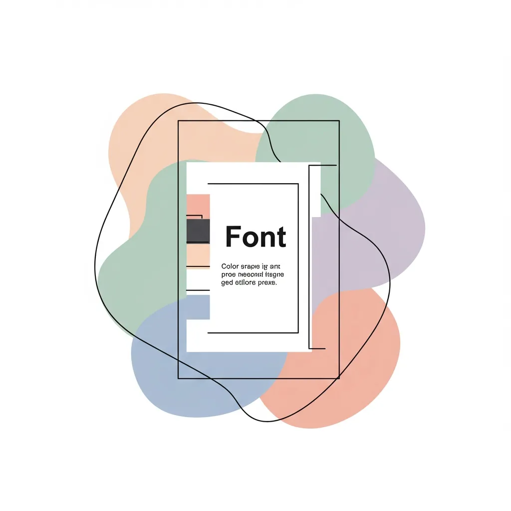
Selecting the Right Brand Fonts
The fonts you use communicate a specific personality and tone. Consistency in typography is crucial for a polished and professional look.
Serif vs. Sans-Serif: The two primary categories of fonts. Serif fonts have small decorative lines (serifs) at the end of strokes, while sans-serif fonts do not.
Limit your brand to two fonts at most—one for headlines and one for body text—to maintain clarity and readability.
| Font Type | Vibe | Best For |
|---|---|---|
| Serif | Traditional, Authoritative, Formal | Resumes, long-form content, print documents |
| Sans-Serif | Modern, Clean, Approachable | LinkedIn profile, website copy, digital presentations |
Curating Your Professional Brand Imagery
The images you use, especially your headshot, are often the first point of contact for recruiters and connections.
Your professional headshot should be high-quality, recent, and reflect the persona you want to project. It is a critical asset for your LinkedIn profile.
Beyond headshots, consider the style of graphics or icons you use in presentations or on social media. Tools like Canva can help you create visually consistent content.
Frequently Asked Questions
How do I ensure my visual brand is consistent?
Create a simple, one-page personal brand style guide. This document is your single source of truth for all visual elements.
Your style guide should include your color palette (with HEX codes), your chosen fonts, and examples of your brand imagery.
Use this guide to ensure every professional asset, from your resume to your email signature, aligns with your established visual identity.
How Cruit Helps You Maintain a Consistent Brand
Cruit’s suite of tools helps you build and maintain a powerful, consistent professional brand with ease.
The LinkedIn Profile Generator instantly creates profile content that aligns with the professional narrative in your resume, ensuring brand consistency across platforms.
Cruit's Generic Resume Module and Resume Tailoring Module provide clean, professional, ATS-friendly templates. The intelligent formatting algorithm ensures your layout is always perfect, providing a polished visual foundation that you can easily customize with your brand fonts and colors.
This guide was created by Cruit, a career growth platform that helps professionals build and execute their career strategy.